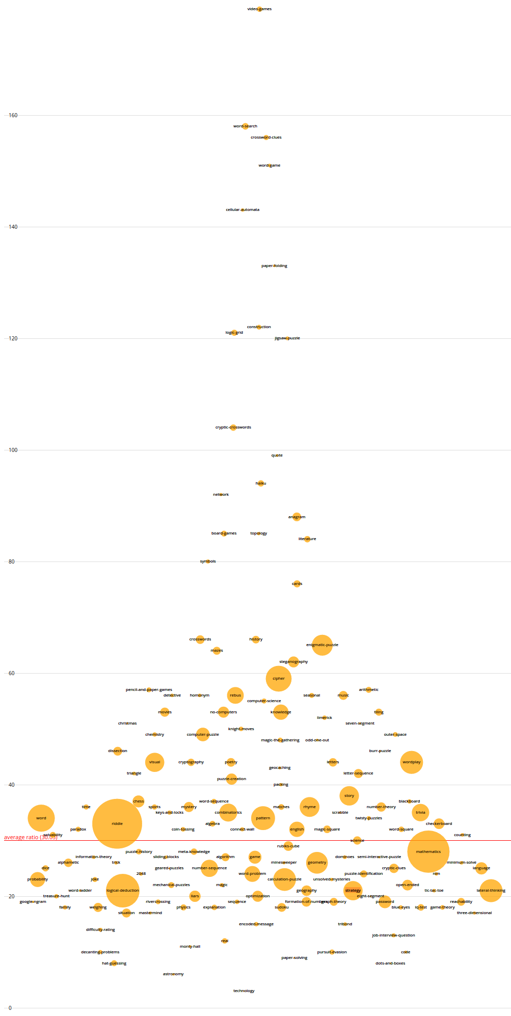
I made a chart.
I used this SE Data Explorer query to get up/down votes and question counts for all of our tags, and plotted them with D3.js to get this:
 (Click for a full view.)
How to read it
Tags appear as circles, which is proportional to the total votes on questions which have that tag. They are arranged vertically by upvote/downvote ratio. Horizontal position is just for visual separation.
The red line shows an average ratio of votes for a tag. This was calculated by dividing all tags' total upvotes by all tags' total downvotes.
Cautionary notes, because I am not a statistician:
- 35 tags that had no downvotes were excluded, to dodge division-by-zero. They applied to 139 questions at most total, which is a little smaller than the probability bubble on the left.
- Overlap caused by questions having multiple tags is unaccounted for here. Every question counts as +1 for all of its tags, regardless of number of tags.
- This is an overall view, of all questions across all time, not of recent events.
Interpretation
Ideally, we'd want to see as much orange as possible as high up as possible. Our tags are mostly clustered with up/down ratios between 20 and 40.
I would conclude that if riddle has a quality problem, so does almost everything else. Riddles are perhaps getting all the eyes because there are lots of them, both good and bad. Our next two most popular tags mathematics and logical-deduction are doing worse on the up/down ratio front, and in fact worse than tags are doing on average.
Conclusions
For our solutions against low-quality content to be long-term, they must generalise beyond a single tag.
I'll put the code on Github sometime soonish in case anyone wants to improve or repurpose it.

